Buying a house is just the first step in. With it comes a series of procedures one has to go through to turn a house into a home!
One of the key elements is interior designing. Decor of a house help to bring out the aesthetics that makes it feel like a home. This can happen in a number of ways, but to make the whole look cohesive and most aligned with your own vision, the colour of the house is extremely important.
For example, a burgundy wall can make the home too gaudy while grey can make it too drab. Gender-neutral yellow for the nursery is more appropriate than pink or blue. Certain colors have significance over others based on their looks and appearance. For instance, red is associated with anger, but also resembles love. The right kind of color will help in reflecting the persona of you and your space better.
The easiest way to initiate the house décor is by knowing about the various colour related terminology. This helps in choosing the colour palette for walls, furniture, art, and other essentials that you want to fit into your space.
Here are some of the most widely used colour terminology:
➢ Saturation: This term refers to stronger and paler shades. In very professional terms, saturation is about – how a particular shade looks and different types of lighting. It also has to do with the purity of the colour- the darker, the purer it is. Therefore, orange is a bright colour as compared to dark green. Someone who wants to have a darker room (such as in the bedroom for ease in sleeping), saturation helps them decide the right colour for their preferences. Also children’s rooms are also lighter in shade, so saturation measures of colour are helpful to find the right environment for your kids.
➢ Value: Value refers to the darkness and lightness of the colour. Technically, value is also the quantity of light reflected by a hue. If executed correctly, the gradation of differently valued colours can create spatial illusions which are of utmost importance while designing a home. Value enables a designer to create an illusion of larger spaces without actually creating any. This comes in handy when homes or rooms are smaller but want to look spacious. Contrasting shadows and light coupled with value create environments as required. An illusionary three dimensional space can also be created.
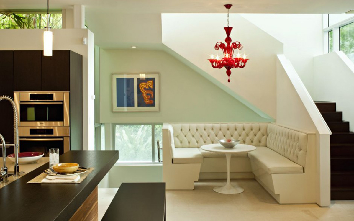
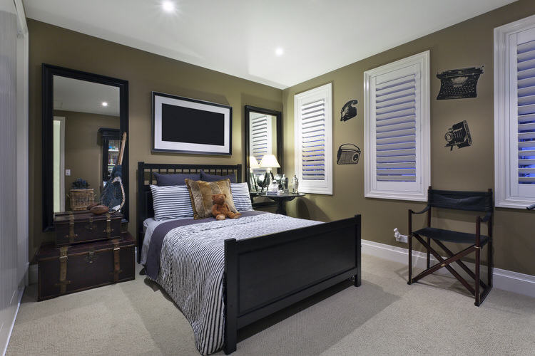
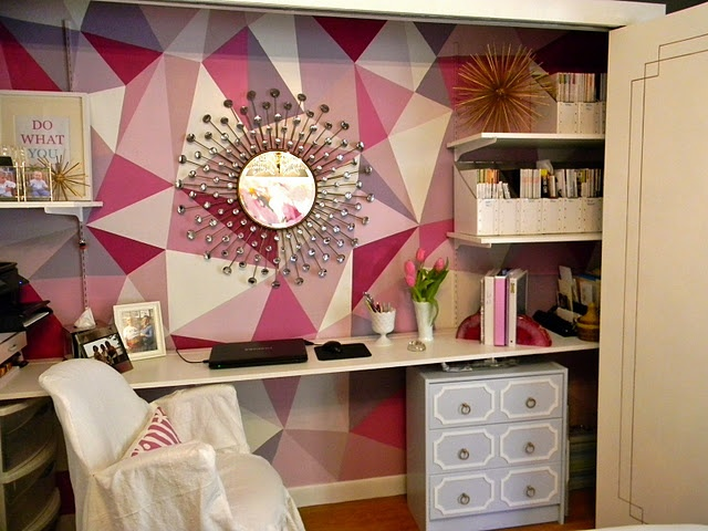
➢ Tones, Tints and Shades: These three terms are closely related to the above term of value. Tones are created when grey is added to any hue. Tints are created when white is added to a colour while shades are the products of mixing black into different colours. The base colours to which the rest are added are always ‘pure’. Anything grey creates an antique or vintage feel. When used on walls, it can act as a background for portraits to be hung on the wall. Bathroom tiles on the floor are usually of this shade in order to balance between too dark and too light colours. Pastel tints are great for the living room since they are bright and cheerful.
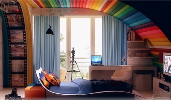
➢ Overtones and Undertones: Overtone is the term used to express the subjective feelings we associate with colours. Hues of blue, pink and green are thought to be cool because we associate them with water, beaches and forests. On the other hand reds, oranges, navy blues are associated with the hot or angry feelings. Hence whenever anything tropical or Hawaiian is portrayed, it is always lathered in blues and greens whereas for extremely hot and sunny conditions red is considered more apt. Undertones refer to the base colour of any shade. Base colours can either be warm (like red) or cool (such as blue). Warm colours would normally have a distinct yellowish feel to them. Cool undertones would look like they have been mixed in blue. Undertones are useful in gradation much like the values of colours.